Text Widget is one of the simplest and most used widgets that flutter provides. It is essentially a way of presenting text on the screen. Depending on the constraints that we have defined for our layout, there is the possibility to break the text into multiple lines and / or use other features in order to avoid an overflow. The style of the text is totally up to you and the needs of your application. If you don’t provide a specific style then the DefaultTextStyle class is chosen. Following we will see many things about the Text Widget, the special features that provides and the styling that we can apply.
Display a simple Text on the Screen
The simplest way to use the Text Widget is just to display a single line of text on the screen. An example is given below:
import 'package:flutter/material.dart';

void main() {
  runApp(MyApp());
}

class MyApp extends StatelessWidget {
  @override
  Widget build(BuildContext context) {
    return MaterialApp(
        theme: ThemeData(
          primarySwatch: Colors.blue,
        ),
        home: MyTextPage());
  }
}

class MyTextPage extends StatelessWidget {
  @override
  Widget build(BuildContext context) {
    return Scaffold(
      appBar: AppBar(title: const Text("Example of Text Widget")),
      body: const Center(child: Text("This is an example of a Text Widget")),
    );
  }
}
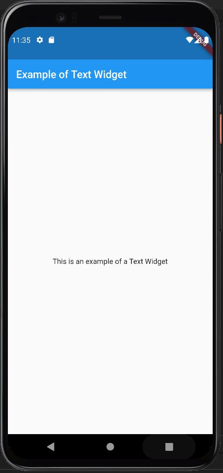
The produced outcome of this code is depicted in the following image and as you can we managed to print a single line of text at the center of the screen.

Constructor of the Text Widget
The above example is the simplest form of a Text Widget. Although, the text widget constructor gives us the possibility to add more functionalities and styling to our text. The complete constructor is given below alongside a brief explanation of its properties:
const Text(String data,{
    Key key,
    TextStyle style,
    StrutStyle strutStyle,
    TextAlign textAlign,
    TextDirection textDirection,
    TextOverflow overflow,
    bool softWrap,
    double textScaleFactor,
    int maxLines,
    String semanticsLabel,
    TextWidthBasis textWidthBasis,
    TextHeightBehavior textHeightBehavior
    }
) - TextStyle: is the most used property of the Text Widget which allows us to style our text giving the desired values to a number of attributes. A dedicated sub section on the styling is given below.
- TextAlign: alignment is a basic need when we are dealing with text and this property allows us to define where we want our text to be shown.
- MaxLines: is used to define the number of lines in which the text will be shown
- Overflow: is used to determine how the text will be shown when there will be not enough space available
- SoftWrap: It is used to determine whether or not to show all text widget content when there is not enough space available. If it is true, it will show all content. Otherwise, it will not show all content.
- TextDirection: is used to change the direction in which we write the text (usually we write from left to right but we can change it).
Styling Text
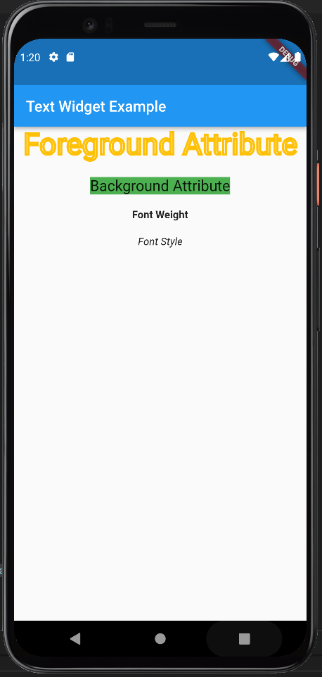
The styling of the text could be an individual post but we will do our best to cover as much as we can in this section. Developers have the possibility to play around with the values of many attributes until they find the best match for their needs. The text styling attributes with a brief explanation are given in the table below alongside with a few examples to demonstrate the effects.
| Attributes | Description |
|---|---|
| foreground | The foreground color of the text. |
| background | The background color of the text widget. |
| fontWeight | The thickness of the text. |
| fontSize | The text size. |
| fontFamily | It specifies the fonts that we want to use. |
| fontStyle | It styles the text (i.e. bold/italic). |
| color | The color of the text |
| letterSpacing | The distance between the characters of the text |
| wordSpacing | The distance between two words. |
| shadows | It displays a shadow underneath the text. |
import 'package:flutter/material.dart';

void main() {
  runApp(MyApp());
}

class MyApp extends StatelessWidget {
  @override
  Widget build(BuildContext context) {
    return MaterialApp(
        theme: ThemeData(
          primarySwatch: Colors.blue,
        ),
        home: MyTextPage());
  }
}

class MyTextPage extends StatelessWidget {
  @override
  Widget build(BuildContext context) {
    return Scaffold(
      appBar: AppBar(title: const Text("Text Widget Example")),
      body: Center(
        child: Column(children: [
          Text(
            "Foreground Attribute",
            style: TextStyle(
                fontSize: 40,
                foreground: Paint()
                  ..style = PaintingStyle.stroke
                  ..strokeWidth = 3
                  ..color = Colors.amber),
          ),
          const SizedBox(
            height: 20,
          ), // adds space among the widgets
          Text(
            "Background Attribute",
            style: TextStyle(
                fontSize: 20, background: Paint()..color = Colors.green),
          ),
          const SizedBox(
            height: 20,
          ), // adds space among the widgets
          const Text(
            "Font Weight",
            style: TextStyle(fontWeight: FontWeight.w800),
          ),
          const SizedBox(
            height: 20,
          ), // adds space among the widgets
          const Text(
            "Font Style",
            style: TextStyle(fontStyle: FontStyle.italic),
          ),
        ]),
      ),
    );
  }
}