Container Widget is a very important element of flutter applications and it is considered a parent widget which includes several child widgets. Its importance is coming from the fact that with a container we can control multiple parameters of the child widgets such as the width, the height, the margin, the padding, the background color etc.
If the container does not have any children then it will occupy the whole screen. Although, if we provide child widgets then the container will automatically wrap those widgets according to the given height and width. It is very important to say that a container widget cannot be displayed directly but rather it needs a parent widget which can be a Scaffold, a Row, a Column, a Padding or a Center widget.
When do we need a Container widget?
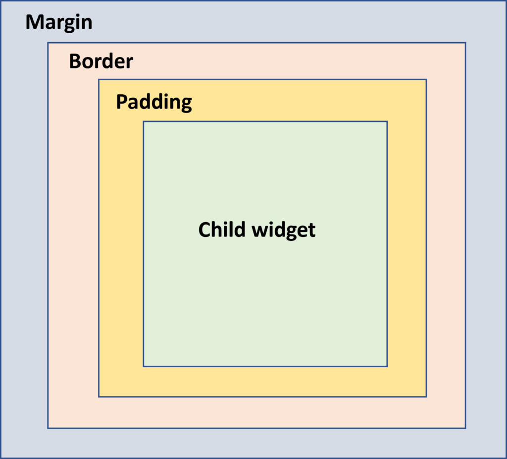
In most of the cases a Container gives us the possibility to handle in an easy and efficient way the design and the positioning of the child widgets. So for example, if we have a Text widget and we want to give a specific shape or a background color or apply some dimension constraints then it would be a good idea to wrap it in a container widget. The three main properties of a basic container are the margin, the border and the padding. With those parameters we surround the child widgets as shown in the picture below.

Constructor of a container widget
A constructor of a container has the following parameters:
Container({Key key,
           AlignmentGeometry alignment,
           Widget child,
           Clip clipBehavior,
           EdgeInsetsGeometry padding,
           Color color,
           BoxConstraints constraints,
           Decoration decoration,
           Decoration foregroundDecoration,
           EdgeInsectsGeometry margin,
           Matrix4 transform
           AlignmentGeometry transformAlignment,
           double width,
           double height,
});- alignment: With this property we set the position of the child within the container. The possible values are: center, bottom, bottom center, topLeft, centerRight, left, right, topRight and more.
Container(
  alignment: Alignment.center,
)- child: we define the child widget that we want to keep inside the container.
Container(
  child: Text("I like containers"),
)- padding: As shown also in the picture above this property is used to set a distance among the border of the container and the child widget. The distance can be added in all directions at the same time or the user can use in which direction to add it. In order to set the padding we use the EdgeInsets.all(), EdgeInsets.only(), EdgeInsets.symmetric() depending on where we want to add the distance.
Container(
  padding: EdgeInsets.all(15)
)

or

Container(
  padding: EdgeInsets.only(top: 10, left:15)
)

or

Container(
  paddind: EdgeInsets.symmetrice(vertical: 10, horizontal:15)
)- color: This property is used to set the background color of the container. Worth noting is that when we also set a decoration property color should not be added. In the following example we set the background color in a light shade of brown.
Container(
  color: Colors.brown[200]
)- constraints: It is used when we want to add more constraints on the child widget of the container. The main constructors of the constrained property are the tight, loose and expand. For example:
- tight: It gives a fixed size to the child
- expand: We can “play” with the height, the width or both values
Container(
  constraints: BoxConstraints.tight(Size size)
      : minWidth = size.width,
        maxWidth = size.width,
        minHeight = size.height,
        maxHeight = size.height
)

or

Container(
  constraints: BoxConstraints.expand(height: 30.0),
)- decoration: As the name declares, this property gives us the possibility to decorate our container. Usually, we use a BoxDecoration() constructor which allows us to define several parameters such as the border of the container, its color, the borderRadious if we want to create a container with circular edges etc. As stated also previously if we define the decoration we need to use the color parameter of the decoration in order to set the background color of the container. If we want to paint in front of a child then we need to use the foregroundDecoration.
Container(
  decoration: BoxDecoration(
        border: Border.all(color: Colors.black),
        color: Colors.brown[200],
        borderRadius: BorderRadius.circular(15),

        boxShadow: [
             BoxShadow(color: Colors.green, offset: Offset(6.0, 6.0),),
         ]
          ),
)- margin: As shown also in the picture above this property is used to surround our container with an empty space of specific dimensions. The margin property is usually used in order to distinguish a widget from another one. The dimensions can be set for all directions at the same time or the user can use in which direction to add it. In order to set the padding we use the EdgeInsets.all(), EdgeInsets.only(), EdgeInsets.symmetric() depending on where we want to add the distance.
Container(
  margin: EdgeInsets.all(20),
)- transform: this property allows us to rotate the container in any direction.
Container(
  transform: Matrix4.rotationZ(0.1),
)
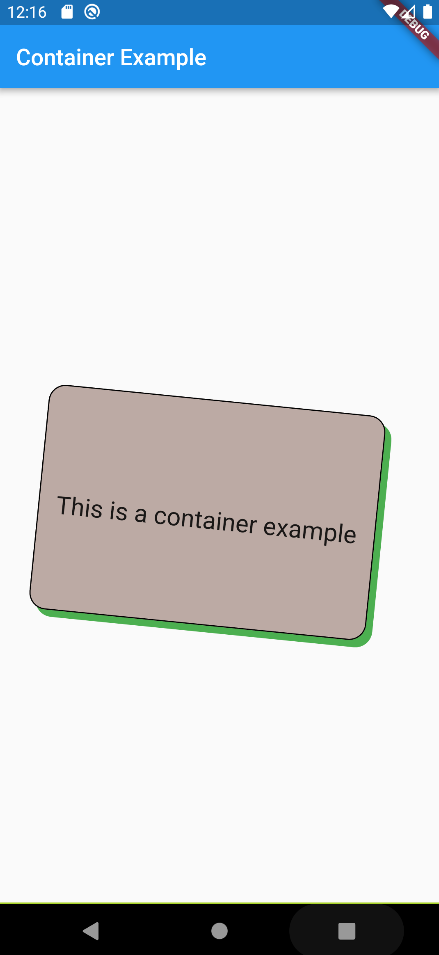
A full example of a container is given below alongside with the produced result.
import 'package:flutter/material.dart';

void main() {
  runApp(MyApp());
}

class MyApp extends StatelessWidget {
  @override
  Widget build(BuildContext context) {
    return MaterialApp(
        theme: ThemeData(
          primarySwatch: Colors.blue,
        ),
        home: MyTextPage());
  }
}

class MyTextPage extends StatelessWidget {
  @override
  Widget build(BuildContext context) {
    return Scaffold(
      appBar: AppBar(
        title: const Text('Container Example'),
      ),
      body: Center(
        child: Container(
          child: const Text(
            'This is a container example',
            style: TextStyle(fontSize: 22),
          ),
          height: 200,
          width: 300,
          clipBehavior: Clip.none,
          //color: Colors.brown[200],
          padding: const EdgeInsets.only(top: 15),
          alignment: Alignment.center,
          transform: Matrix4.rotationZ(0.1),
          decoration: BoxDecoration(
            border: Border.all(color: Colors.black),
            color: Colors.brown[200],
            borderRadius: BorderRadius.circular(15),
            boxShadow: const [
              BoxShadow(
                color: Colors.green,
                offset: Offset(6.0, 6.0),
              ),
            ],
          ),
        ),
      ),
    );
  }
}
