Scaffold widget is one of the core widgets of Flutter. It is actually used to provide a structured view of a screen and in other words it implements the basic material design visual layout. It contains all the elements that we need to create a responsive Flutter application and usually it is a widget that by default occupies the whole screen of the device. In addition, many other widgets that provide core functionality to our application, such as the Drawer, the BottomNavigationBar, the Snackbar, the AppBar, the FloatingActionButton etc., rely on the Scaffold Widget.
The constructor of the Scaffold Widget and an explanation of its core properties is given below.
const Scaffold({
  Key key,
  this.appBar,
  this.body,
  this.floatingActionButton,
  this.floatingActionButtonLocation,
  this.persistentFooterButtons,
  this.drawer,
  this.endDrawer,
  this.bottomNavigationBar,
  this.bottomSheet,
  this.floatingActionButtonAnimator,
  this.backgroundColor,
  this.resizeToAvoidBottomPadding = true,
  this.primary = true,
}) - appBar: It is the top bar of the application. Usually, in the appBar we include the title of the application and some action buttons (i.e. the “go back” arrow etc.)
- body: It is a required property of the Scaffold widget which holds the main content of the screen. It is usually placed below the appBar and behind the floatingActionButton & drawer.
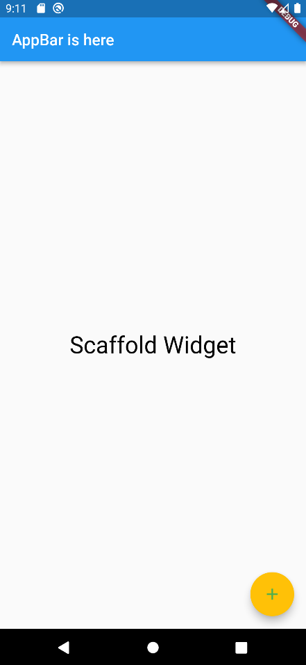
- floatingActionButton: This button is usually displayed at the bottom right corner of the screen. By default it is a circular icon button which controls a primary action of the application (i.e. adding a new user, specifying some filters etc.)
Widget build(BuildContext context) {
    return Scaffold(
      appBar: AppBar(
        title: const Text('AppBar is here'),
      ),
      body: const Center(
        child: Text(
          "Scaffold Widget",
          style: TextStyle(
            color: Colors.black,
            fontSize: 30.0,
          ),
        ),
      ),
      floatingActionButton: FloatingActionButton(
        onPressed: () {},
        elevation: 8,
        backgroundColor: Colors.amber,
        foregroundColor: Colors.green,
        child: const Icon(
          Icons.add,
          size: 24,
        ),
      ),
    );
  }
- backgroundColor: It sets the background color of the Scaffold widget.
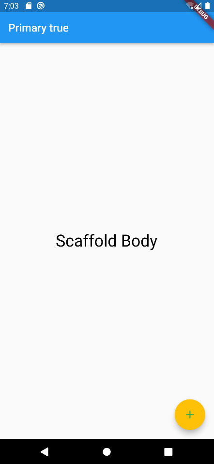
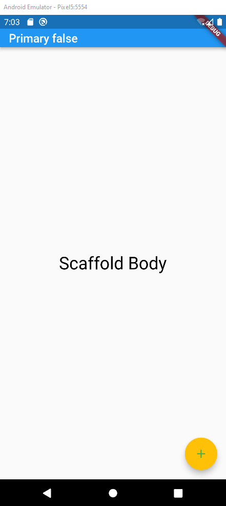
backgroundColor: Colors.grey- primary: It is used to determine if the Scaffold will be displayed at the top of the screen. By default the value is true.
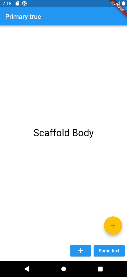
- persistentFooterButton: With this parameter we can set a number of button that will be displayed at the bottom of the Scaffold Widget. Those buttons will be always visible, even if the body of the Scaffold is scrollable. It is worth noting that those buttons do not replace the bottomNavigationBar.
persistentFooterButtons: <Widget>[
        ElevatedButton(
          onPressed: () {},
          child: const Icon(
            Icons.add,
            color: Colors.white,
          ),
        ),
        ElevatedButton(
          onPressed: () {},
          child: const Text(
            "Some text",
          ),
        ),
      ]
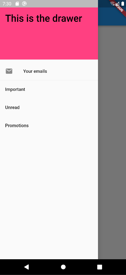
- drawer: It is the slider panel displayed at the right or left side of the body. Usually, the drawer keeps some menu options and in the mobile applications is hidden and the user has to swipe left or light to access it. By default an icon is set to indicate that there is a drawer which the user can access. The gesture is also set automatically to open the drawer.
drawer: Drawer(
        child: ListView(
          children: const <Widget>[
            DrawerHeader(
              decoration: BoxDecoration(
                color: Colors.pinkAccent,
              ),
              child: Text(
                'This is the drawer',
                style: TextStyle(
                  color: Colors.black,
                  fontSize: 30,
                ),
              ),
            ),
            ListTile(
              title: Text("Your emails"),
              leading: Icon(Icons.mail),
            ),
            Divider(
              height: 0.2,
            ),
            ListTile(
              title: Text("Important"),
            ),
            ListTile(
              title: Text("Unread"),
            ),
            ListTile(
              title: Text("Promotions"),
            ),
          ],
        ),
      ),
- endDrawer: Similar to the drawer but it is displayed at the right side of the screen.
- resizeToAvoidBottomInset: If it is true, the body and the Scaffold’s floating widgets should adjust their size themselves to avoid the onscreen keyboard. The bottom property defines the onscreen keyboard height.
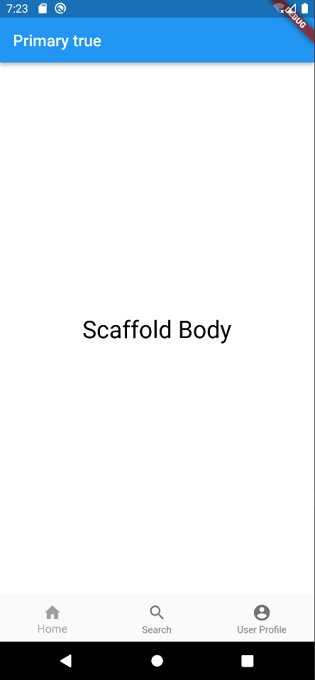
- bottomNavigationBar: This defines a menu that is displayed at the bottom of the Scaffold Widget as the name reveals. This menu is mainly a navigation menu meaning that it gives the possibility to the user to navigate among some main screens of the application.
bottomNavigationBar: BottomNavigationBar(
        currentIndex: 0,
        fixedColor: Colors.grey,
        items: const [
          BottomNavigationBarItem(
            label: "Home",
            icon: Icon(Icons.home),
          ),
          BottomNavigationBarItem(
            label: "Search",
            icon: Icon(Icons.search),
          ),
          BottomNavigationBarItem(
            label: "User Profile",
            icon: Icon(Icons.account_circle),
          ),
        ],
        onTap: (int index) {},
      ),